How HSBC Design for Security


Young designers are often told that the best designs are easy to use, ones that do not require users to think, and are usually completed with just one click.
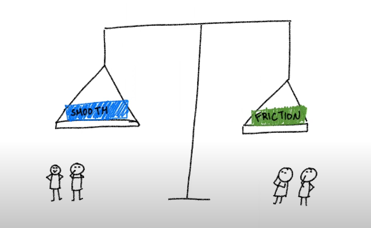
But easy designs aren't always a good thing, and sometimes adding a bit of friction in your designs and user journeys can be beneficial, not just for the users but also the business.
The sole existence of the product I'm working with right now, which is the security and anti-fraud platform, is actually to create frictions in the design.
Why is friction beneficial for Security
Protection
Think of your house, or more specifically, think of your front door. Your front door acts as a barrier against the outside world. And to enter your house, you have to take additional steps. So you need to turn the key, you need to open the door, walk through, you close the door, and don't forget to actually lock the door.
It takes a bit of time to do all these rituals every single time you try to go in and out of your house. But I still assume that everyone would still prefer having a front door rather than not. The lesson here is that adding friction can be equal to security.
Adding a login as part of your user journey is a friction. It adds an extra step before you can see your bank account balance or any accounts. Sometimes it takes a little bit of time to get this step right. Sometimes users will enter a wrong character in the login details, or forget their password. But overall, no one would not want login steps for their bank accounts.
Friction strengthens the feeling of security for your users.
Verification
Adding friction can make users stop and think.
For example, if we are trying to transfer money, and we are following the thought process that no friction is the best for users, users select who they want to send to from their bank account. Then they enter the amount of money they want to transfer and press send. It's all done.
Except they just accidentally pressed an extra zero and sent €400 instead of €40.
Friction in this case could be an added confirmation screen that lets users review and consent to all the information that they have input, making sure that everything is correct before then sending it over to the bank.
It can save the users from accidentally pressing an incorrect amount or sending money to the wrong person. And for the company, it saves a call to the customer centers.
Adding friction at HSBC
Separation of jobs
Last year we noticed that there was a larger drop-off than we expected on one of our login pages. And users took a long time to go through the login journey itself, which is not a good thing.
We realized that our initial approach of providing users with a way to log in right away might actually be the problem. It was really mind-blowing; a smooth login is a problem. And this is because the so-called login page didn't just contain login functionality. It also included other items unrelated to the login steps.
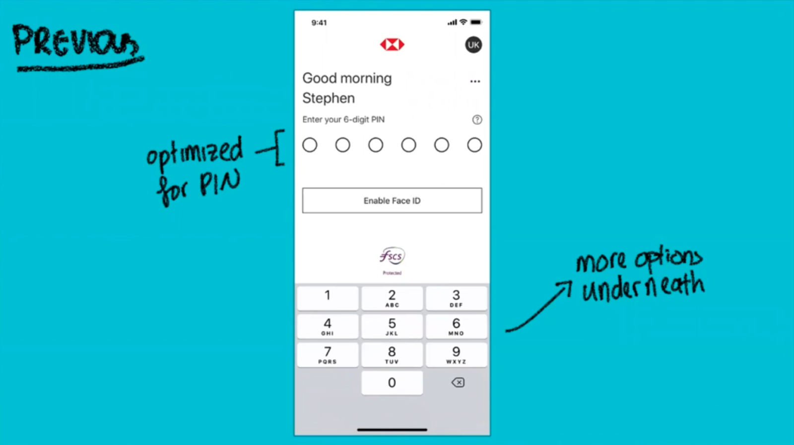
We suspected that the drop-off happened because of the cases where users weren't actually trying to log on. Based on this hypothesis, we created an extra screen. You can think of it as an additional step really. And these screens allow users to easily see all the available functions at a glance. It does not give too much dominance to one or the other.
As expected, there were concerns with this approach because it is adding an extra screen. Users have to click one more time before they can actually log in. So we conducted user testing in several different countries to make sure that these performed against all the tasks that the users coming to this page wanted to do.
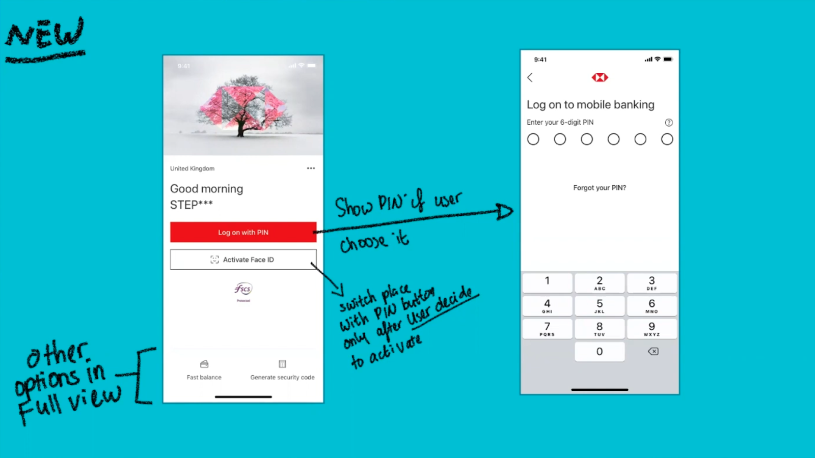
And to our surprise, the results were very promising. The time to log on was slashed by 50% compared to the previous design and drop-offs went down by 10%.
Cognitive Overload
If a person ever opens a bank account or asks for a mortgage online, they have to answer lots of questions and, to no one's surprise, lots of drop-offs happen at this stage. We reviewed our analytics and had a chat with some of the users that actually drop off as well as with the frontline agents and we found that the issue was around our users not having the information needed handy and feeling overwhelmed.
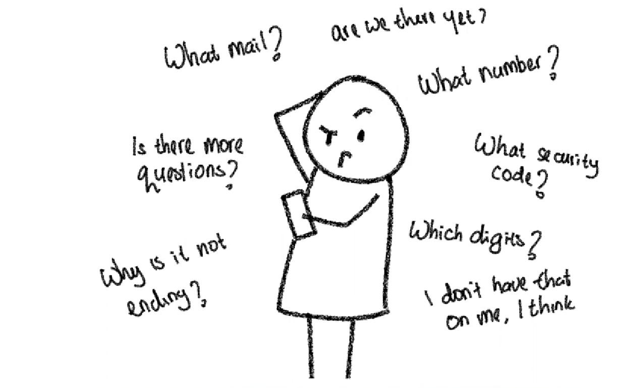
We actually had designed these forms to minimize clicks but by providing all of the questions in one place we were trying to make users digest mountains of information in one go.
During rounds of brainstorming and idea generations, someone said this oldie but good quote by Crayton Abrams.
When eating an elephant, take one bite at a time
I think it actually perfectly summed up our situation.
What we needed to do was cut it into bite-size pieces. We knew that there would be concerns that users could get anxious because they could not see where the end was so we designed against that as well.
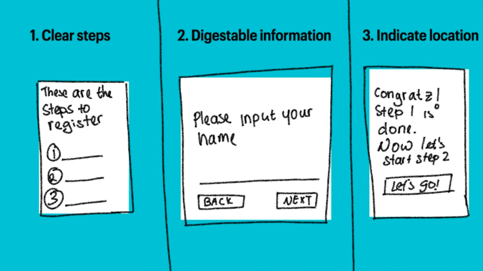
As always, we tested the solutions first to see if it generated any red flags or concerns from users. And when it didn't, we released it into the wild. While it doesn't necessarily speed up the process, it did cut down our drop-offs and increased the completion rate, which was the core goal.
Friction is a tool
Friction is not the enemy, but a tool. And just like any other tool in our design arsenal, there needs to be a balance in its applications.
The strength of friction used should also be adjusted depending on needs. One of the best ways to know how much friction is needed and in what form it should appear can be achieved by understanding the issues one is trying to solve.
Friction does not have to be frustrating. Use it in the right way and friction could be your friend in helping the users use your product.

Jane Saputra
Product Design LeadHSBC
Jane's passion for design and creating great experiences brought her from Malaysia, Canada, Indonesia, and finally to the UK. She had worked with various companies, from agencies to startups, and now as Product Design Lead at HSBC. Her experiences working with cultural teams and launching products in different markets had allowed her to bridge businesses to make meaningful products. She is passionate about building great design teams, enabling them to create great experiences, and helping companies to scale their user-centred approach.
Get latest articles straight to your inbox
A weekly list of the latest news across Product, UX, Design and Dev.