How Trainline is reducing waste in the design process

Product development is hugely wasteful.
In the physical world when we refer to waste we typically are referring to traditional ecological waste. Things like single-use items, non-recyclable materials, and products that favor convenience over usability. A circular economy fixes this by recirculating as much waste product as possible whilst reducing harmful material waste in the first place.
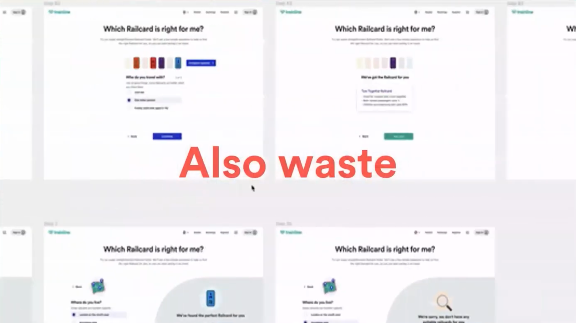
Product development is also wasteful. Historically our tools were disconnected which allowed us to gain bad habits like creating throwaway works, discarded hypotheses, dead-end designs, and single-use documents. And this does have a real-world impact. It impacts project velocity, slows down product cycles, wastes energy from servers and screens, and even impacts our own well-being and time as people. We need to find a way to recirculate our product development waste as well.

Fixing wasteful design
We need to invest in not just designing, but in designing the things and the tools we design with.
Essentially the bold statement here is that systematizing the product process increases scalability and pace.
At Trainline we have been growing post-COVID and have opened up new markets. This has resulted in new teams in different locales like France, Spain, and Italy. Our remote-first way of working, alongside the growth, has stress tested our systems and we found that some of them aren't necessarily fit for purpose.
To achieve our circular goals we created a small guild within the Trainline UX team with the blunt title of the Design Waste Crew. We're working together to rethink and overhaul our DesignOps within the UX team by looking at the inefficiencies in our systems and optimizing them.
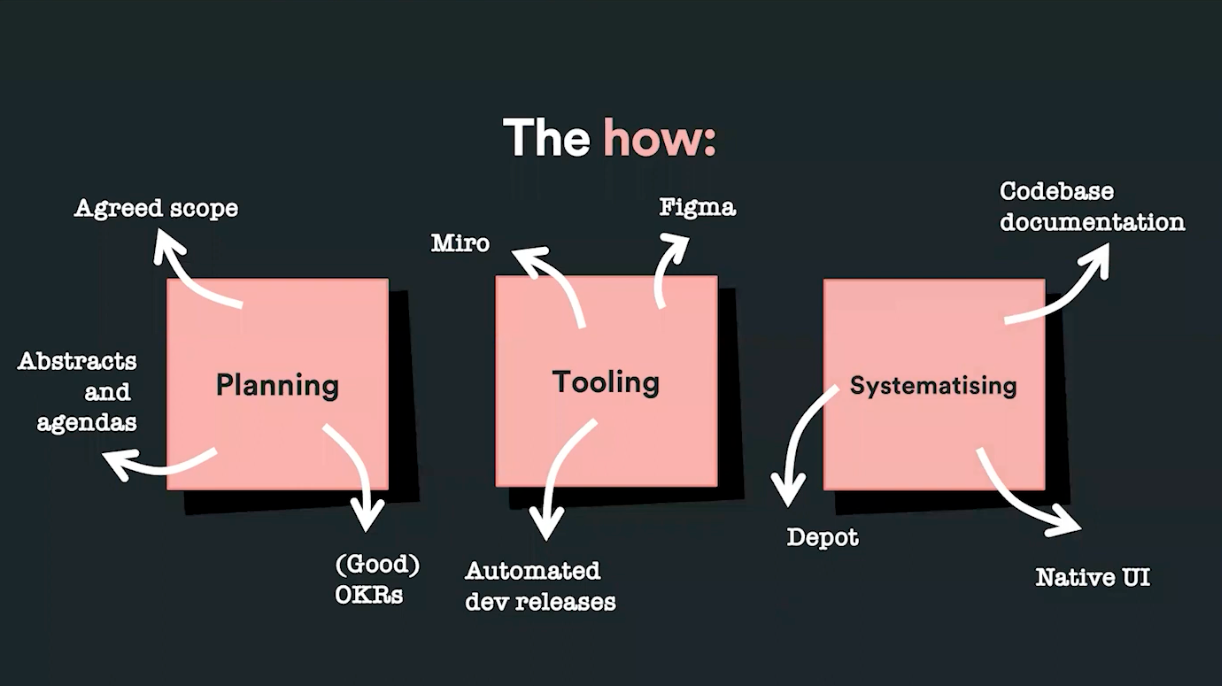
We focus on three core areas for improvement: planning, tooling, and systematizing. Using the principle that designers should empathize with colleagues as much as with customers we collaborate with others on all of our initiatives because we’re better together. Nobody really works in a silo when it comes to product development.

Planning
We want to ensure that we are more effective in our planning. We started by collaborating across the team to map our product landscape and tag it for visibility, which means we're going from not knowing who's doing what and who's working where to having broader visibility over our surface area and identifying where collaboration can occur and making sure that nobody's kind of stepping over anybody else.
We also put in place some standards like ensuring that we have an agreed scope for projects, we have clear abstracts and agendas, and we have good, well-written OKRs.
Tooling
With tooling, our goal is to encourage better and more efficient collaboration and to minimize overheads. We focus on using tools like Figma and Miro which enable much greater amounts of real-time collaboration between people. From the development side, the focus is on automated releases to remove the burden of manual testing and deployments.
Systematizing
We want to systemize our processes to ensure consistency and efficiency across the organization. Our guiding principle here is to design for the v2. What I mean by this is to design like somebody else is going to pick up your work because the chances are they will. To achieve this we implemented a few improvements.
We defined the rules for filing structures and naming conventions, which means going from random unnamed pages and layers to a much more consistent labeling and naming system, which makes files easier to use and easier to work with.
We optimized our design templates for consistency, going from this free jazz concept where everybody has their own way of laying out design files and developers get scared when they open it, to a much more measured way of ensuring consistency.
We made our files easier to find with tagged covers. This is a really simple one and we borrowed it from the Deliveroo product team actually. We upgraded from a very unvisual way of searching for files with very little clue as to what's going on, to a much more systematized, coded method to help find files faster at a glance.
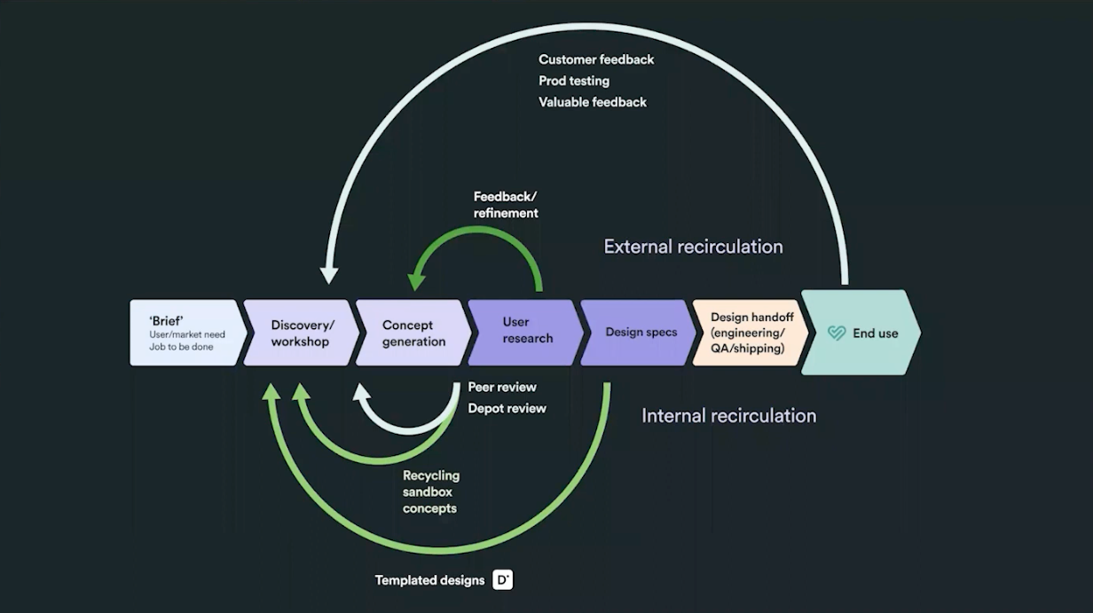
And we ensure that these improvements get fed into our design system, Depot, which distributes the benefits across the organization.
These improvements let us reuse work that we would previously have discarded. Now when we get feedback either from peer reviews or customer reviews and designs need to be edited, since our systems and designs are in a more coded discoverable way, they're easier to find in the future. This means that we can revisit them in future discovery sessions.

Benefits achieved
The benefits of making UX more circular is that it improves efficiency, effectiveness and team happiness. We're not recreating files and screenshots so we have more time to work on solutions that benefit customers. And this increased efficiency not only benefits Trainline, but it improves our well-being and increases job satisfaction. Smarter working leads to smarter design solutions, and that leads to smarter travel for our customers.
Ashley May
Lead UX Designer Trainline
Ashley is a Lead UX Designer at Trainline, delivering industry-leading passenger experiences for rail customers in the UK and Europe. Working at the convergence of design, data and rail, Ashley sees sustainability and customer value at the heart of the product, and leverages customer research and data science to build smarter, faster, simpler travel solutions. Ashley is a passionate advocate of improving accessible booking and travel for all. Before Trainline, Ashley worked as a design lead on key rail booking and travel products for National Rail, GWR and Deutsche Bahn.
Get latest articles straight to your inbox
A weekly list of the latest news across Product, UX, Design and Dev.

