How KAYAK scaled their design system across 7 travel brands and three businesses


KAYAK operates a portfolio of global metasearch brands spanning 60+ markets and 25+ languages. Supported by a lean team of 30+ designers, we realized that the only way for us to scale efficiently was to build a robust design system.
We started our journey off by building the design system for a single brand and creating unified components for all the travel experiences. We then proceeded to expand and scale the design system to the rest of our brands and created a system that was flexible enough to accommodate the unique challenges of each brand and allow for light mode, dark mode, and hybrid light and dark mode brands to exist.
Thanks to the things we learned from expanding our portfolio to seven travel brands, we started applying the principles we learned to white labeling solutions for KAYAK hotels, each of which has its own unique personality, as well as KAYAK for business, which is built to accommodate small to medium sized businesses that want to set up their own flexible travel system.
The three key things that we learned are:
- Design principles are a necessary foundation
- Consistency allows for differentiation
- Foster collaboration between design and engineering
#1 Design Principles are a necessary foundation
It is extremely important to establish a foundational design language and design principles that will guide us to make decisions and to apply a consistent experience across our site. So first off, we have our design values.
We believe that empathy, simplicity, and familiarity are foundational when it comes to our design and our user experience. Empathetic design helps us prioritize the human, simplicity helps us focus on the essence and familiarity helps us leverage and build on existing mental models.
Further to this we also have guiding principles that help us make decisions as we build our design systems.
The principles are to:
- use typography and spacing to create visual hierarchy
- embrace a 'less is more' mindset towards color
- design like you're having a conversation
- delight the user with the details
- apply imagery to context
Principles in Practice: Typography
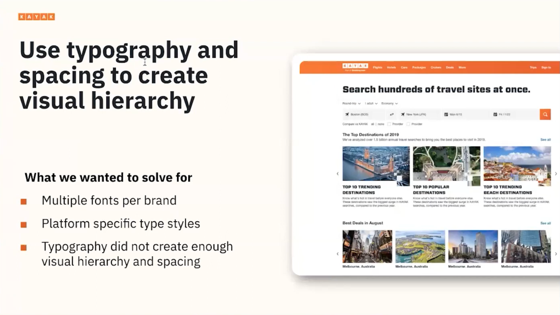
In the previous version of our design system, we had selected to show hierarchy using two different fonts, one being used for stronger, prominent content. This strategy ended up creating a few problems for us because the mixing of the two fonts resulted in confusing hierarchies and cluttered information. Our strong header font was working well for large headers but did not translate well in smaller content pieces, especially nested hierarchies. We also realized that this type didn't scale well on smaller screens.
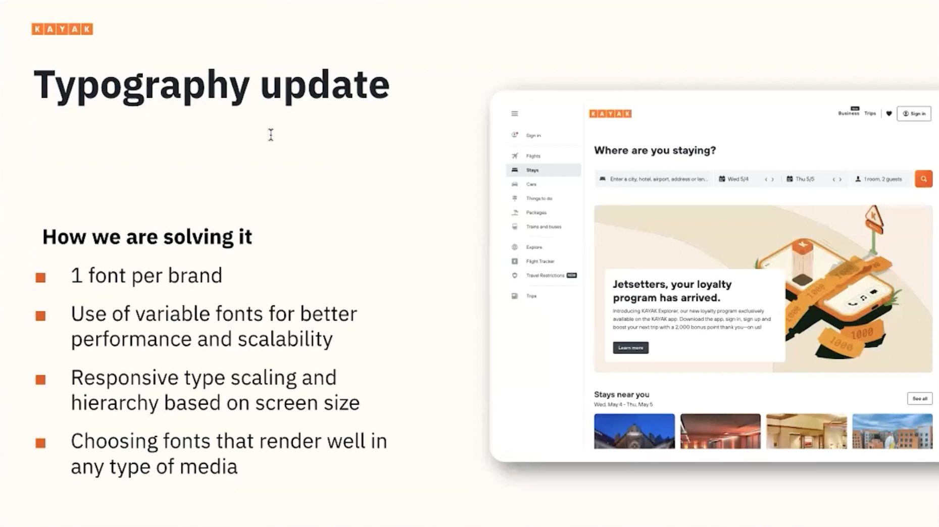
A big change we made was to limit our font use to one per brand. By choosing one font per brand, we've been able to simplify the typography tokens, which allowed us to achieve multiple goals. First of all, switching between each brand experience is easy because the structure is the same. Secondly, we were able to set up our design system for different screen sizes instead of for different platforms. And last but not least, from a technical perspective, moving to a single font, which includes all font definitions in one font file, helped us to improve site performance and server requests.
It’s not all perfect yet though. We're using specific fonts per native platform, thus adding another layer of differentiation between the experiences we design. We are now working on moving away from this towards this new model of a technology-agnostic definition of type by setting up typography for responsive scaling, instead of building a separate definition of hierarchy for each platform, like native mobile and web.
Principles in Practice: Color
We were relying on color extensively to communicate messages, which was both restrictive for accessibility purposes, but also created a very overwhelming layout. It's important to note that our brand color is orange, a color that I would describe as competitive in the sense that it doesn't allow for a lot of other bright colors to coexist well and form good hierarchies.
Secondly, reliance on color was making scalability to other brands even more of a challenge because of having to translate all these colors to each theme. A lot of the color simplification was achieved by reserving our brand color for the main call to actions that show progression down the conversion funnel.
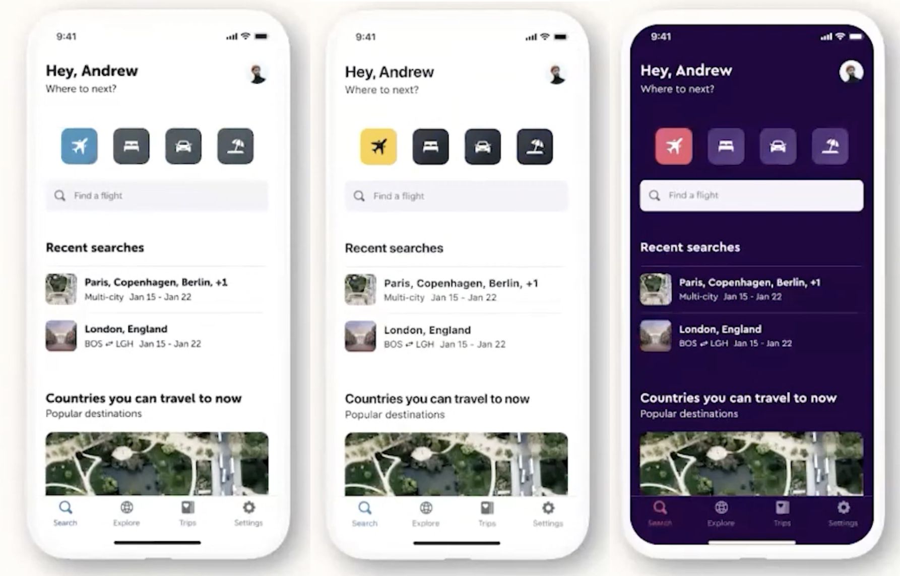
Related to our color strategy was the concept of creating pure light and dark themes, which simplified the theming model so we could apply the same color model to all brands. We then used functional colors for all our UI components, which helped us a lot in building the dark theme by taking the same definition and just changing the values. The design principles are the basis for a scalable theme model for all our brands.
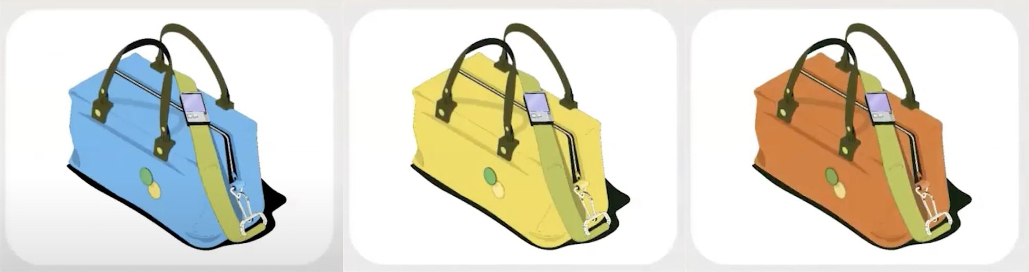
Finally, we expanded the model to other brand themes. It allowed us to dream big and move on to new challenges, for example creating impactful illustrations. Our illustrations follow a consistent system by using isometric styles and functional colors.
#2 Consistency allows for differentiation
The design system helped us to achieve consistency across our products but we realized that a cookie-cutter system that's inflexible doesn't allow for differentiation and was not going to work for a regionalized market. Our three biggest brands were strong in their ability to hear and correspond to the needs of different regional users like North America, Europe, or APAC. One of the most prominent spaces for differentiation is our homepages.
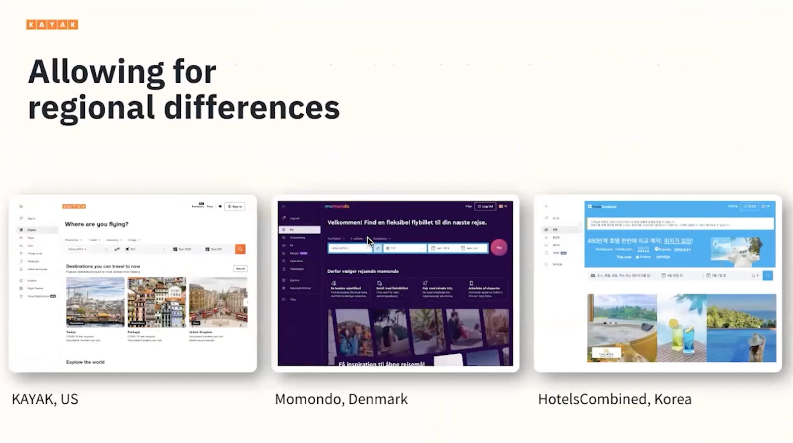
The tricky balance here is to be strategic about where to be different because if we break the system too frequently, then a lean team can no longer support it. It is clear that every differentiation increases the cost of maintenance, as well as the number of edge cases to account for in each design decision. Therefore, we have to tread carefully when we're introducing differentiation. The big question is how do we validate that a difference is necessary and provides unique value to a specific locale?
We ensure that we regularly get feedback from users from different regions and then we supplement that information with regional experts in our design team that can bring experience from big markets like Korea, and they also educate the rest of the team on UX patterns and user preferences, competitive analysis of local products, and other knowledge that will help us understand the need for regionalized differentiation.
Finally, KAYAK has a sophisticated system for A-B testing that helps us validate changes to our product. It also helps us easily test if an experience with design based on a local need would provide a better experience globally and not just in a specific region.
#3 It is a team effort between design and engineering
If you're at the beginning of your design systems journey, we highly recommend having engineering on board and finding your engineering best buddies. Design, engineering, and product are a core team that needs to work closely together.
Thanks to our engineering best buddies, we strategically made choices for a baseline UX that is using the same components for all brands. It also helped us create integrations between design and code through component libraries, design tokens, and the scalable theming model.
The benefits of this hard work
One of the signals that we like to track to help us acknowledge and celebrate the success of our design systems integration is that the design team rarely gets questions about foundational style definitions from developers anymore. Thus, it's saving us a lot of valuable time when it comes to engineering handoffs or questions through development. And the developer handoff has also greatly improved because of how aligned the design system is with our UI code libraries.
Secondly, all of our platforms are using design tokens from the same source of truth. Therefore, scaling has become very efficient.Finally, all of the above have helped our designers have time available to spend on product design and user experience instead of making sure to align for consistent UI or offer ongoing support during development.

Alkistis Mavroeidi
Head of Design and ResearchInsurify
Alkistis Mavroeidi is Head of Design and Research at Insurify, focusing on Research and Retention Strategies. Prior to her time at Insurify, Alkistis was Director of Product Design at KAYAK, where she led a global team of Product Designers and UX Researchers working on KAYAK's metasearch product. She holds a bachelor’s degree in Architectural Engineering from Greece’s NTUA polytechnic school and a Master in Design Studies (MDes) from the Harvard Graduate School of Design.
Get latest articles straight to your inbox
A weekly list of the latest news across Product, UX, Design and Dev.